Calculus Product Labels (WIP)
Use Product Labels to add clear product messaging across your storefront. You can create either standard image badges or flexible service rows for delivery, finance, promotions, availability and other customer-facing information.
Product Label Library
The Product Label Library is the central place to find, filter, create and manage labels. Open it from Content > Product Labels.
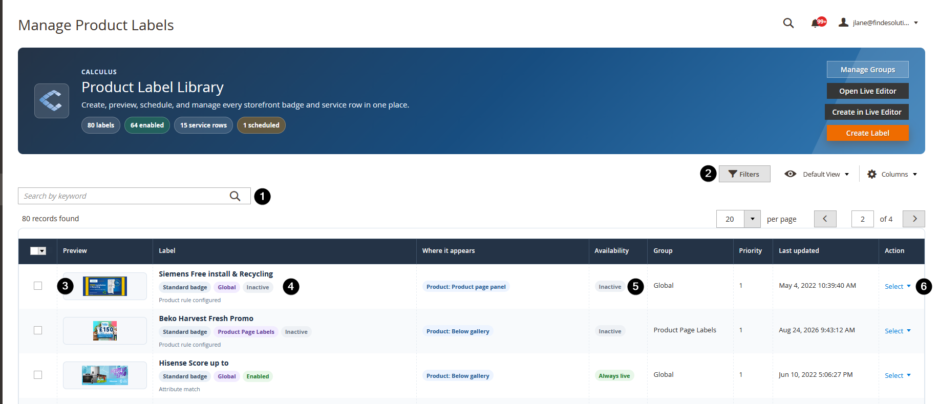
- Keyword search - Find a label by its internal title.
- Filters - Narrow the library by label type, status, group or availability.
- Image preview - Shows the image currently assigned to the label.
- Label type and status - Shows whether it is a standard badge, service row or branch availability row, and whether it is enabled.
- Availability - Shows whether the label is currently live, scheduled or inactive.
- Label action menu - Open Live Editor, edit or delete an individual label.
- Header actions - Manage groups, open Live Editor, create in Live Editor or create a standard label in Admin.
Use Open Live Editor when you want to browse the storefront and choose a label there. Use Live Editor from an individual label action when you already know which label you want to edit.
If you switch to another label while you have unsaved changes, Live Editor asks whether you want to Save then switch, Discard and switch, or Cancel. This prevents accidental loss of work.
What you can create
Label type | Best for |
|---|---|
Standard image badge | Warranty badges, sale graphics, finance logos, promotion graphics and product data-sheet markers. |
Service information row | Flexible rows containing an icon or image, title, supporting copy, optional tooltip and optional link. |
Branch availability row | A service row which can display configured branch availability information. |
Live Editor availability
Live Editor is the recommended way to create and configure Product Labels. It lets you work against the real storefront, see private visual feedback as you edit, switch device previews, inspect placement and save only when the label looks right.
Live Editor needs a one-off site setup by Calculus support. Once it has been enabled, use it for new labels and for updating existing labels wherever possible.
If Live Editor is not available
You can still use the normal Create Label and Edit forms to create and update standard image badges in the established way. These badges continue to support the legacy placement options, including:
- product-gallery and catalog-image corners;
- product-page panel / aside-right rows;
- below-gallery rows; and
- catalog above-image positions.
The badges will work normally, but the site will not have the modern Live Editor benefits: live storefront feedback, visual device previews, page label selection, image library workflow and flexible service-row configuration.
Service information rows and branch availability rows need Live Editor to be enabled. If you need those newer label types but cannot open Live Editor, contact Calculus support to arrange the secure site setup.
Label groups
Groups organise your Label Library and Live Editor list. They do not change which products can see a label.
- Labels with no group are shown as Global.
- Choose a group while creating or editing a label.
- You can create a group from the label form or Live Editor.
- Use Manage Groups from the Product Label Library to create, review and delete groups.
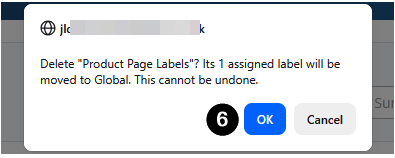
- When a named group is deleted, its labels are moved safely back to Global. The labels themselves are not deleted.
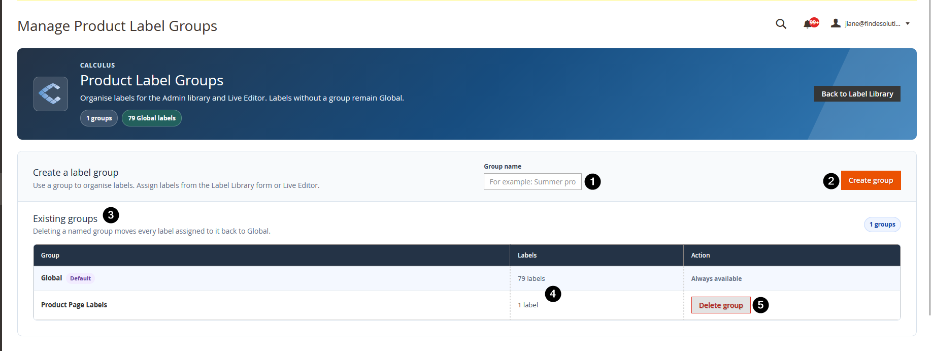
- New group name - Enter the name of a new group.
- Create group - Adds the new group to the library.
- Existing group - A group currently available for labels.
- Label count - Shows how many labels belong to that group.
- Delete group - Removes the group, not its labels.
- Delete confirmation - Confirms that labels in the deleted group move safely back to Global. This action cannot be undone.
Creating or editing a label
- Go to Content > Product Labels.
- Select Create Label, Create in Live Editor, or edit an existing label.
- Give the label a clear internal Title.
- Turn Enabled on when it is ready to use.
- Optionally select a Label group.
- Optionally set a start and/or end date.
- Choose what you are creating: a standard badge, service row or branch availability row.
- Add conditions if the label should only appear on selected products.
- Configure its image, content, placement and device visibility.
- Preview and save.
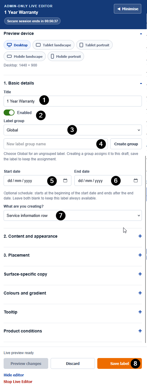
- Title - An internal name used to identify the label in Admin and Live Editor.
- Enabled - Turn this on only when the label is ready to appear.
- Label group - Organises labels in the library. Choose Global if no group is needed.
- Create group - Creates a new group and assigns it to the current draft. Save the label to keep that assignment.
- Scheduled start date - Keeps the label hidden until this date.
- Scheduled end date - Stops the label appearing after this date.
- What are you creating? - Choose a standard image badge, service information row or branch availability row.
- Save Label - Saves the label and makes it available to the storefront when all conditions are met.
Scheduling labels
Start and end dates are optional.
- Leave both blank to keep the label available whenever it is enabled and its conditions match.
- A start date keeps the label hidden until that date.
- An end date removes it after that date.
- Scheduling works alongside Enabled status and product conditions.
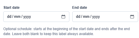
- Scheduled start date - The label is hidden until this date.
- Scheduled end date - The label stops appearing after this date.
- No dates selected - The label remains available whenever it is enabled and its product conditions match.
Product conditions
Product conditions use Magento's normal nested rule builder.
- Leave the rule empty to apply the label to all otherwise eligible products.
- Click a condition to choose its attribute, operator and value.
- Use the green + to add a condition.
- Use the red x to remove a condition.
- If you open Please choose a condition to add and change your mind, use its red x to remove that unfinished row.
- Use ALL when every condition must match, or ANY when one matching condition is enough.
- Use Reload conditions if the visible rule builder needs refreshing.
- Use Open full Admin editor when you need the full-page Magento rule-builder view.
Always preview the rule against one matching and one non-matching product before publishing it.
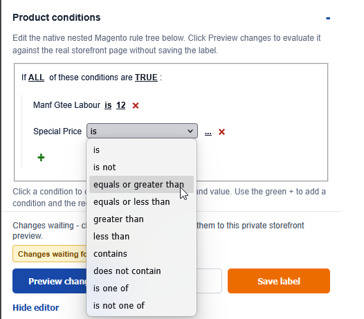
- ALL or ANY - Choose whether every condition must match, or whether one matching condition is enough.
- Product attribute - Select what to test, such as brand, category, special price or a custom attribute. (if any are not visible please contact support to have additional attributes exposed to this condition list)
- Operator - Choose how the attribute should be checked, such as is, contains or greater than.
- Value - Enter or choose the value that should match.
- Add condition - Use the green
+to add another condition. - Remove condition - Use the red remove icon to remove a condition.
- New-condition row - Select another condition to add, or remove the unfinished row if you change your mind.
Standard image badges
Standard badges use an uploaded image or an image selected from the Product Label image library.
Choose the product-page and catalog-card positions independently. Select None for a destination where the badge should not appear.
Typical uses include:
- warranty graphics
- finance logos
- sale or promotion graphics or
- delivery or trust badges.
Badge images
You can:
- upload a GIF, JPG, JPEG or PNG; or
- choose an existing image from the Product Label library.
The library contains only Product Label media. It does not expose the store's full Magento media library.
Badge placement in Live Editor
For a standard image badge, Live Editor shows 3. Badge placement instead of the service-row placement controls.
- Product-page position controls the selected product-page badge location.
- Catalog-card position controls the selected catalog-card badge location.
- Priority controls the order of badges in the same location; lower numbers appear first.
- Badge text and Promotion text mode can add a short promotional message to a compatible badge image.
- Label link URL can make a badge clickable. Select Open label link in new window only where this is useful for the customer journey.
Grid View
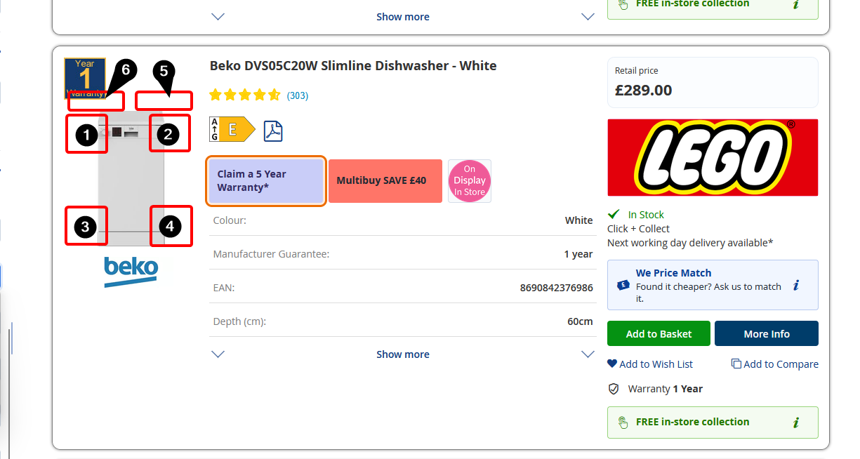
- Catalog-card position controls the selected catalog-card badge location. (These apply to both Grid and List views of the catalog)
- Top Left
- Top Right
- Bottom Left
- Bottom Right
- Above Image Right
- Above Image Left
Product Page View
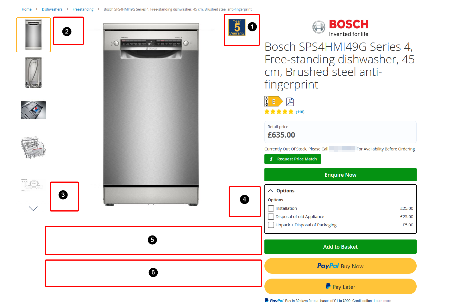
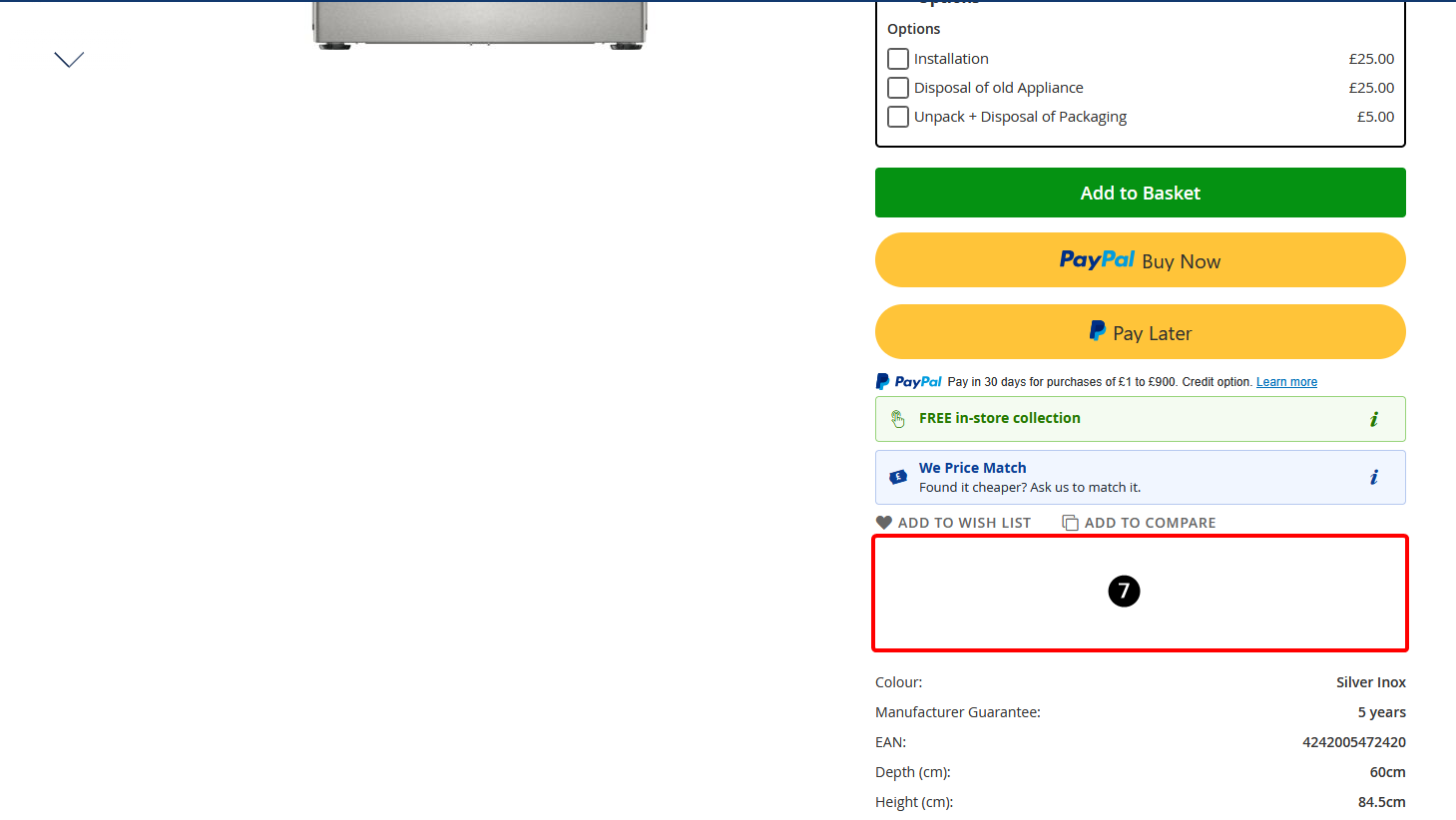
- Product-page position - Choose where the badge appears on an individual product page.
- Top Right
- Top Left
- Bottom Left
- Bottom Right
- Below Gallery 1
- Below Gallery 2
- Below Gallery 2 (Aside Right Row 1, 2 & 3) You can use these to stack labels in order, if aside right row 3 is populated and not 1 and 2, it will simply not display these rows.
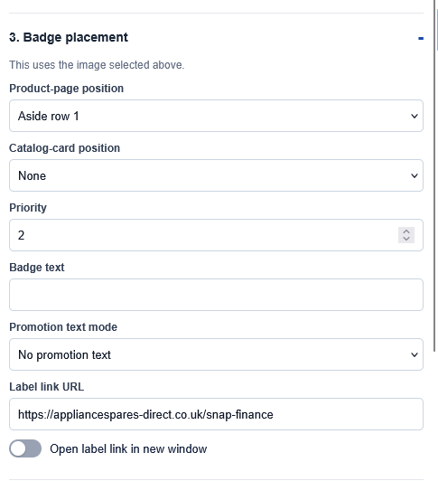
- Priority - Orders badges that use the same location.
- Badge text - Adds short text to a compatible badge image.
- Promotion text mode - Selects whether promotional text is shown as a percentage, amount or plain display text.
- Label link URL - Optional destination for a clickable badge.
- Open label link in new window - Opens the configured link in a new browser tab.
Service rows
Service rows are flexible customer-information panels. A row can contain a theme icon or uploaded image, title, supporting copy, optional tooltip and optional link.
Content and style
For a service row, configure:
- store views;
- row title and supporting copy;
- display spacing: Compact, Standard, Relaxed or Custom;
- style preset: Neutral, Success, Finance, Trust, Custom colours or None (transparent);
- a theme icon, uploaded image or no icon;
- tooltip content and link; and
- spacing, custom colours, gradients, border, icon and text colours.
Leave both copy fields blank to create an image-only service row.
Use Store views to choose which storefronts can use the service row. Select the relevant store views, or All store views where the same message should be available everywhere.
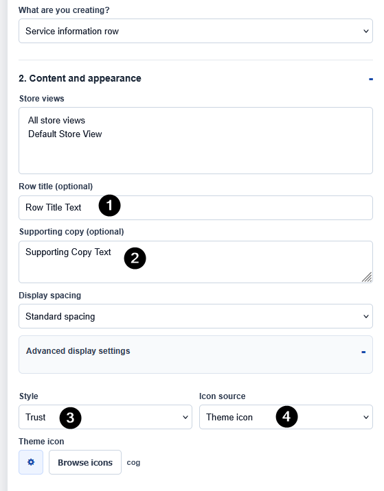
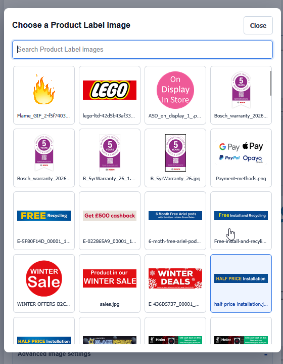
Image Selection
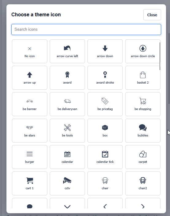
Icon Selection
- Row title - Main customer-facing message.
- Supporting copy - Optional secondary text beneath or beside the title.
- Style - Choose a visual preset such as Neutral, Success, Finance, Trust or None.
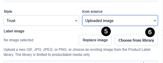
- Icon source - Choose a theme icon, uploaded image or no icon.
- Replace image - Upload a new image for this label.
- Choose from library - Reuse an image already stored in the Product Label image library.
- Browse icons - Open the visual icon picker and select a theme icon.
- Display spacing - Choose the recommended Standard spacing, or a more Compare/Relaxed layout.
- Advanced display settings - Available when Display spacing is set to Custom; controls the icon-and-copy gap and space after the row.
Image and icon pickers
Use Browse icons to open a searchable visual list of approved theme icons. Select No icon if the row should have no icon or image.
Use Choose from library to search and select an existing Product Label image. This library is intentionally limited to Product Label media, so it does not expose unrelated website images.
Uploaded images and alignment
When Icon source is set to Uploaded image, open Advanced image settings to control:
- image layout;
- Image size beside copy: Compact, Standard, Large or Custom;
- maximum image width and height; and
- Image alignment: Start, Centre or End.
Use Image size beside copy when an uploaded image sits alongside a title or supporting copy. Standard is the recommended starting point for readable promotion graphics; Custom uses the maximum width and height fields below. Compact keeps the small icon-sized appearance.
Image alignment is useful when an image-only row has unused horizontal space, for example a natural-width warranty image above a product image. Centre is the default. Fill and Cover use the full available width, so alignment does not materially change those layouts.
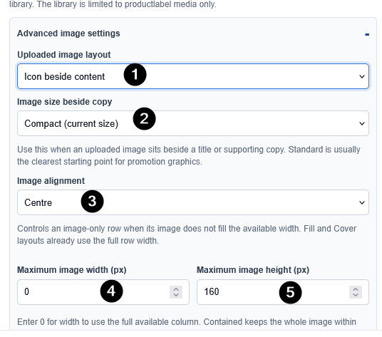
- Uploaded image layout - Controls how the image sits within the label.
- Image size beside copy - Choose Compact, Standard, Large or Custom when an image appears beside text.
- Image alignment - Align an image-only label to the start, centre or end of its available space.
- Maximum image width - Limits the rendered image width when using Custom sizing.
- Maximum image height - Limits the rendered image height when using Custom sizing.
Where a service row can appear
Enable each destination independently, then choose its location, row width where available, row order and visible devices.
Destination | Available locations |
|---|---|
Catalog (Grid Display) | Within grid card or Top of card (above product image) . Top-of-card rows can be full, half or flexible width. |
Catalog (List Display) | First column: above product image , first column below product image/brand, middle column below product details, or right column (flex ordered). The above-image choice stays within the first column; it never spans into the other columns. |
Product page | Top of information panel, below price and delivery, or below add-to-basket actions. |
Calculus Product Display | Compatible Calculus Product Display cards or widgets where labels are enabled. |
Product Sliders | Supported Page Builder product sliders: top of card, above price or below availability/delivery. |
Product Sliders are a fixed card layout. Multiple service rows in the same slider rail are ordered by the label's Priority instead.
For Calculus Product Display, the relevant Product Display widget or carousel must also have labels enabled in its own settings.
- Destination toggle - Turns the label on or off for this storefront area.
- Placement dropdown - Chooses the exact location within that area.
- Row width - Controls whether compatible service rows use the full width, half width, flexible width or another available option.
- Row order - Controls the order of labels that share the same location.
- Device visibility - Select the desktop, tablet and mobile layouts where the label may appear.
- Placement help - Use the
?icon for an explanation of where that option renders on the storefront. - Current Layout Order - If applicable this will show other visible lables orders, allowing you to easily identify where to place your label with ease
- Destination toggle - Turns the label on or off for this storefront area.
- Placement dropdown - Chooses the exact location within that area.
- Row width - Controls the width used by the label where supported.
- Row order - Controls the order of labels in the same location.
- Device visibility - Select the supported device layouts.
- Placement help - Explains the selected storefront location.
Surface-specific copy
Use Surface-specific copy only when the same service row needs different wording in different locations. You can override the title and supporting copy for Catalog Grid, Catalog List, Calculus Product Display and Product Sliders.
Leave an override blank to use the default row title and supporting copy from Content and appearance.
- Catalog card title and supporting copy - Optional wording for Catalog Grid cards.
- Catalog list title and supporting copy - Optional wording for Catalog List cards.
- Product Display title and supporting copy - Optional wording for supported Calculus Product Display widgets.
- Product Slider title and supporting copy - Optional wording for supported product sliders.
Colours, gradients and tooltip styling
The chosen style preset is the recommended starting point. Select None (transparent) when the row should have no preset background or border.
For a custom design, use the colour picker or enter a full hexadecimal colour value. You can set row background, gradient start and end, border, title, supporting copy, icon and information-icon colours. The same section also includes tooltip background, border and text colours.
Leave custom colour fields blank to retain the selected style palette. A gradient needs both a start and end colour; Gradient angle controls its direction.
- Use selected style palette as custom colours - Starts custom styling from the current preset colours.
- Row background and gradient colours - Controls the main label background.
- Border, title, supporting copy and icon colours - Controls the label's visible details.
- Tooltip colours - Controls the information tooltip appearance.
- Gradient angle - Controls the direction of a configured gradient.
Tooltips and links
A service row can show an information tooltip when extra detail would be useful but should not always be visible.
- Turn on Enable tooltip.
- Add an optional tooltip title and supporting text.
- Add an optional link label and link URL where customers need a next step.
- Tooltip links can be a site-relative path beginning with
/, or a validhttporhttpsURL.
- Enable tooltip - Shows the information icon on the service row.
- Tooltip title - Optional heading in the tooltip.
- Tooltip text - Supporting information shown when the tooltip opens.
- Tooltip link label and URL - Optional customer call to action.
Device visibility
Every destination has device pills:
- Desktop
- Tablet landscape
- Tablet portrait
- Mobile landscape
- Mobile portrait
A selected pill means the row is eligible to appear at that device profile. Use Live Editor's device controls to check the real storefront behaviour before saving.
These device pills control whether customers can see the label at each layout. They are separate from the Preview device controls at the top of Live Editor, which only change your private preview size.
Using Live Editor
Live Editor opens the real storefront in a separate popup window with an Admin-only editing tray on the left.
You can open it from:
- Open Live Editor in the Product Label Library header;
- Create in Live Editor in the header;
- Live Editor in a label's action menu; or
- Live Editor on a saved label's normal edit form.
If your browser blocks the popup, allow popups for the site and try again.
Live Editor panel order
The tray is designed to be worked through from top to bottom. Some sections are shown only for the selected label type.
- Header and session timer - Shows the label being edited, the remaining secure session time and the minimise control.
- Private-preview notice - Confirms that changes are private until the label is saved.
- Label library - Search, filter, switch, create and highlight labels.
- Preview device - Check the storefront at desktop, tablet and mobile layouts.
- 1. Basic details - Title, enabled state, group, schedule and label type.
- 2. Content and appearance - Service-row copy, spacing, style, icons and images.
- 3. Badge placement - Shown for standard image badges.
- 3. Placement - Shown for service rows and branch availability rows.
- Surface-specific copy, Colours and gradient, and Tooltip - Additional service-row controls.
- Product conditions - Controls which products can receive the label.
- Footer actions - Preview changes, discard, save, hide or stop Live Editor.
Preview device
Use Preview device to view the real storefront at desktop, tablet landscape, tablet portrait, mobile landscape or mobile portrait sizes. This does not change where the label is allowed to appear; use the device pills in Placement to configure customer visibility.
Live Editor unavailable?
Ask Calculus support whether the site's secure Live Editor setup has been completed. Until it is available, standard image badges can still be managed through the normal Admin form, but without Live Editor's visual preview and service-row tools.
- Search labels - Find a label by title.
- Label-type filters - Show all labels, service rows or standard badges.
- Group filter - Show labels from one group or all groups.
- Show inactive labels - Include disabled or currently unavailable labels in the list.
- Pick a label from this page - Select a label that is currently visible on the storefront.
- Create a new label - Start a new draft directly in Live Editor.
- Selected label and availability - Shows which label is being edited and whether it is enabled.
- Highlight selected label - Clearly outlines the selected label on the storefront.
- Preview device - Switch between desktop, tablet and mobile preview sizes.
Working in the tray
- The tray can be collapsed and resized.
- When the tray is hidden, use the small Edit label control to reopen it.
- Every main section can be expanded or collapsed.
- Label library lets you search labels, filter by group, include inactive labels, select a label already visible on the page, or create a new label.
- The selected label is marked in the library list. Enable highlighting to locate it on the storefront.
- Device controls switch the preview between desktop, tablet and mobile layouts.
- Placement
?buttons explain exactly where each selected destination renders.
Preview, save and discard
- Preview changes applies the draft only to your private storefront preview.
- Save label saves the label for normal storefront use.
- Discard restores the last saved state.
- Hide editor temporarily collapses the tray while keeping the private preview session open.
- Changes are not live for customers until you save the label.
The tray keeps its scroll position and open sections after a private preview refresh, so you do not need to scroll back to the same field repeatedly.
Session timer
Secure Live Editor sessions last for up to one hour. The tray shows a visible Secure session ends in countdown and changes warning colour during the final five minutes.
Save work before the timer expires. When the secure session ends, the editor closes itself safely. Reopen Live Editor to start a fresh session.
Stopping Live Editor
Select Stop Live Editor when you have finished. The popup closes the private editing session and returns to the Product Labels Admin page.
- Secure session timer - Shows how long the current Live Editor session remains active.
- Minimise - Collapses the editing tray so more of the storefront is visible.
- Resize handle - Drag to make the editor tray wider or narrower.
- Highlighted label - Shows the label currently being edited on the storefront.
- Preview changes - Applies the draft only to your private preview.
- Discard - Removes unsaved changes and restores the last saved version.
- Save Label - Publishes the saved label for normal storefront use.
- Hide editor - Temporarily collapses the tray without ending the session.
- Stop Live Editor - Ends the private preview session and returns to Product Labels in Admin.
Legacy standard badge configuration (when Live Editor is unavailable)
This section applies when Live Editor has not been enabled for a site. Standard image badges can still be created and edited through the normal Admin form. This is the established configuration route for traditional badges placed over product or catalog images, in product-page panels and in legacy row locations.
It does not provide the newer visual editing, service-row placement, device preview or page-selection tools. Contact Calculus support if you would like Live Editor enabled for your site.
- Image preview - Shows the image currently used by the badge.
- Upload - Upload a new GIF, JPG, JPEG or PNG badge image.
- Badge position on product page - Choose where the badge appears on product pages.
- Badge position on catalog cards - Choose where the badge appears on catalog and compatible product cards.
- Save Label - Saves the standard badge configuration.
Before publishing: quick checklist
Is the label itself enabled?
- Do its schedule dates include today?
- Do its conditions match the intended products?
- Is the right label group selected for easy administration?
- Is the correct destination enabled?
- Are the expected device pills selected?
- Does the label look right on desktop, tablet and mobile?
- If it is an image-only row, is its width and image alignment correct?
- Has the final version been saved, not only previewed?
Need help?
If Live Editor is unavailable, a secure session expires unexpectedly, or a label does not appear after all of the checklist items have been confirmed, contact Calculus support with:
- the label name;
- the page URL and product SKU being tested;
- the selected destination and device profile; and
- a screenshot of the label form or Live Editor tray.